A short video with captivating experience offering a diverse range of engaging content
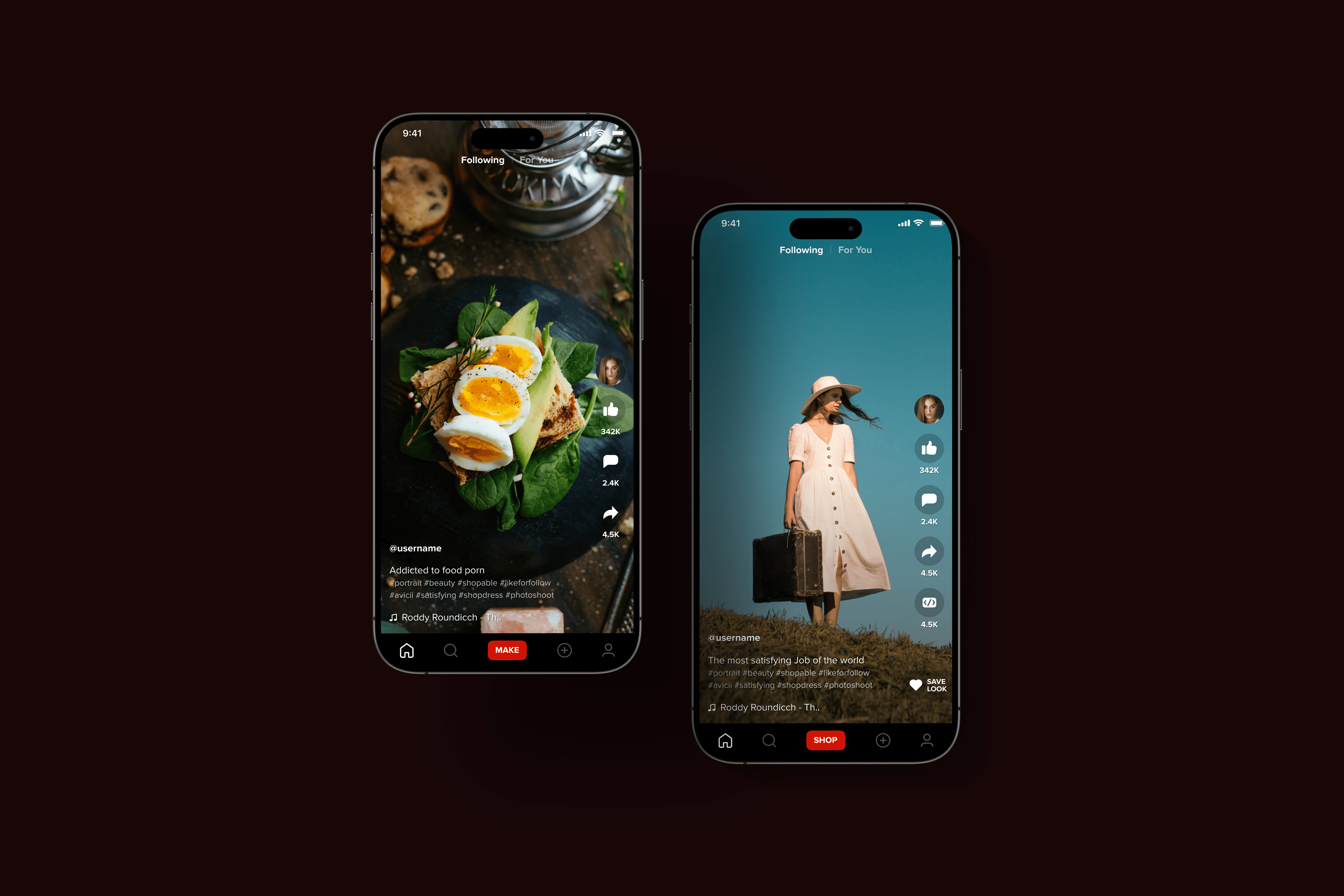
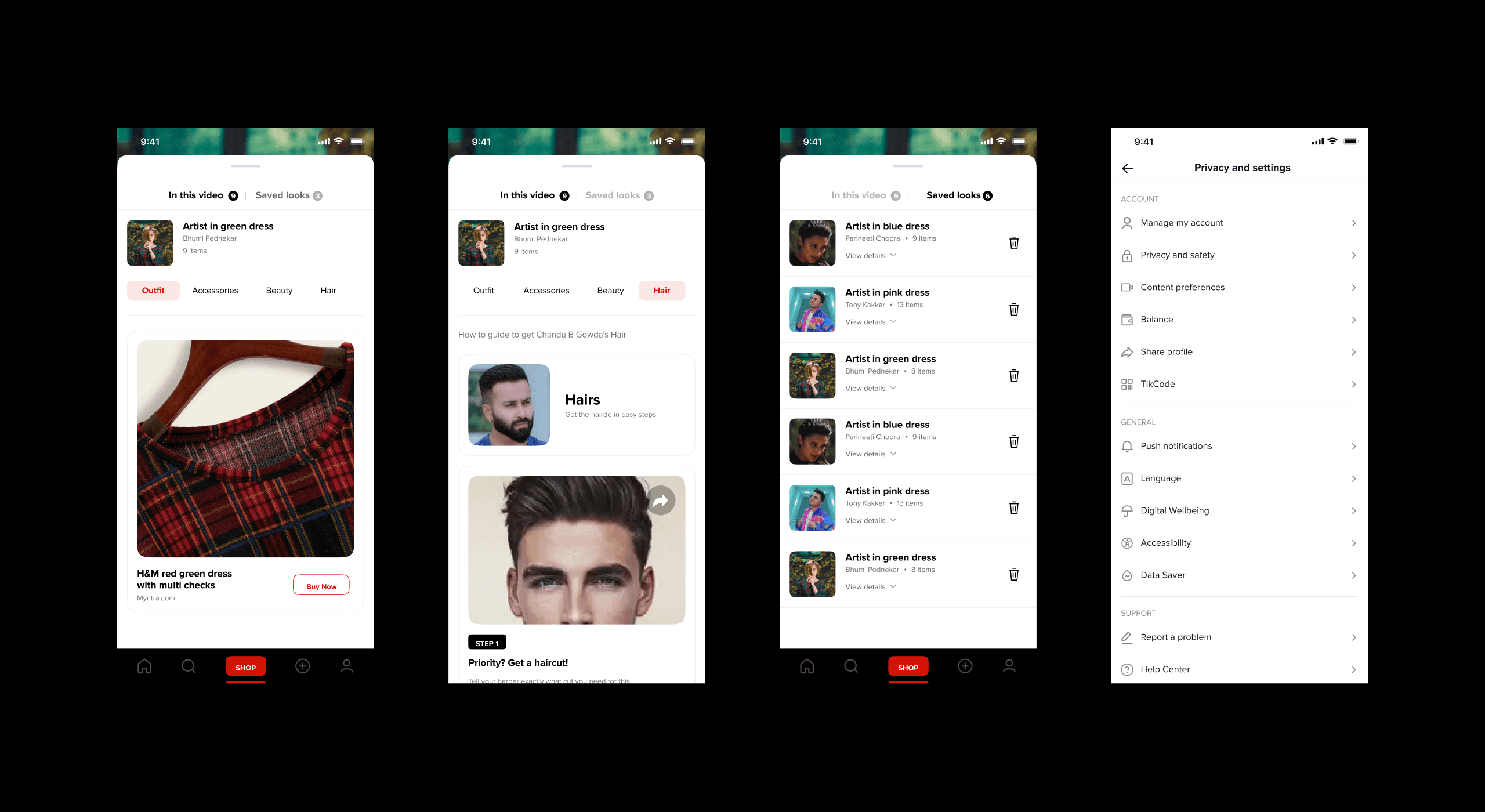
The aim of the Hipi revamp was to elevate the app to be on par with competitors like TikTok and Instagram. We focused on integrating a seamless shopping experience, enabling creators to add links for purchasing products featured in their content. This shopping feature was designed to feel native, blending organically with video content to avoid appearing as disruptive advertisements.
Our user research centered on understanding how users interact with short video formats and their attention spans. We aimed to create an immersive shopping experience that complemented the entertainment value without hindering engagement. By analyzing user behavior, we ensured the shopping links were seamlessly integrated into the video player, allowing users to explore and purchase products effortlessly. This balanced approach aimed to enhance user satisfaction and retention, offering a unique blend of content and commerce on Hipi.


Process
The aim of the Hipi revamp was to bring it on par with competitors like TikTok and Instagram. Additionally, we sought to integrate a shopping experience within the app, allowing creators to add links to purchase products featured in their content. This shopping experience needed to feel native and not like an in-app advertisement. Our user research focused on understanding users' attention spans for short video formats and how to create an immersive shopping experience that doesn't hinder engagement.






Outcome
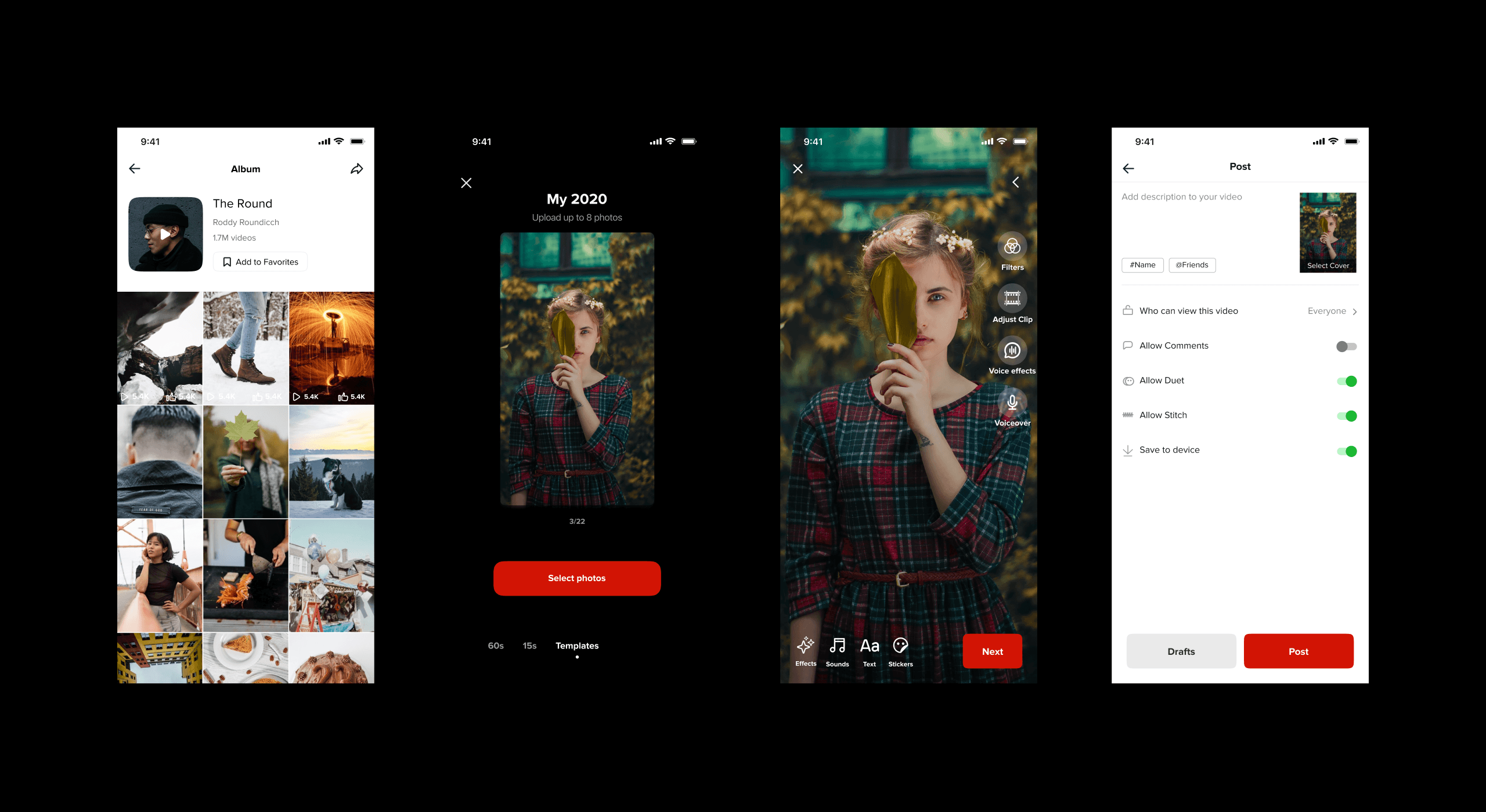
The updated version received widespread appreciation from users, who enjoyed the enhanced experience of short video content combined with a seamless shopping interface. The app's intuitive design and smooth integration of shopping features allowed users to browse and purchase products effortlessly while engaging with their favorite content. This innovative approach not only entertained users but also provided them with a convenient and enjoyable shopping experience within the app.
As a result of these improvements, the app saw a significant increase in user engagement and satisfaction. New user registrations surged by 24%, reflecting the growing popularity and appeal of the updated app. Additionally, the average engagement time per session increased by an impressive 31%, indicating that users were spending more time exploring and interacting with the app’s features.
These positive metrics underscore the success of the update, highlighting the app's ability to captivate users and meet their evolving needs. The seamless fusion of entertainment and e-commerce set a new standard for user experience, positioning the app as a leader in the market.