

Process
Design:
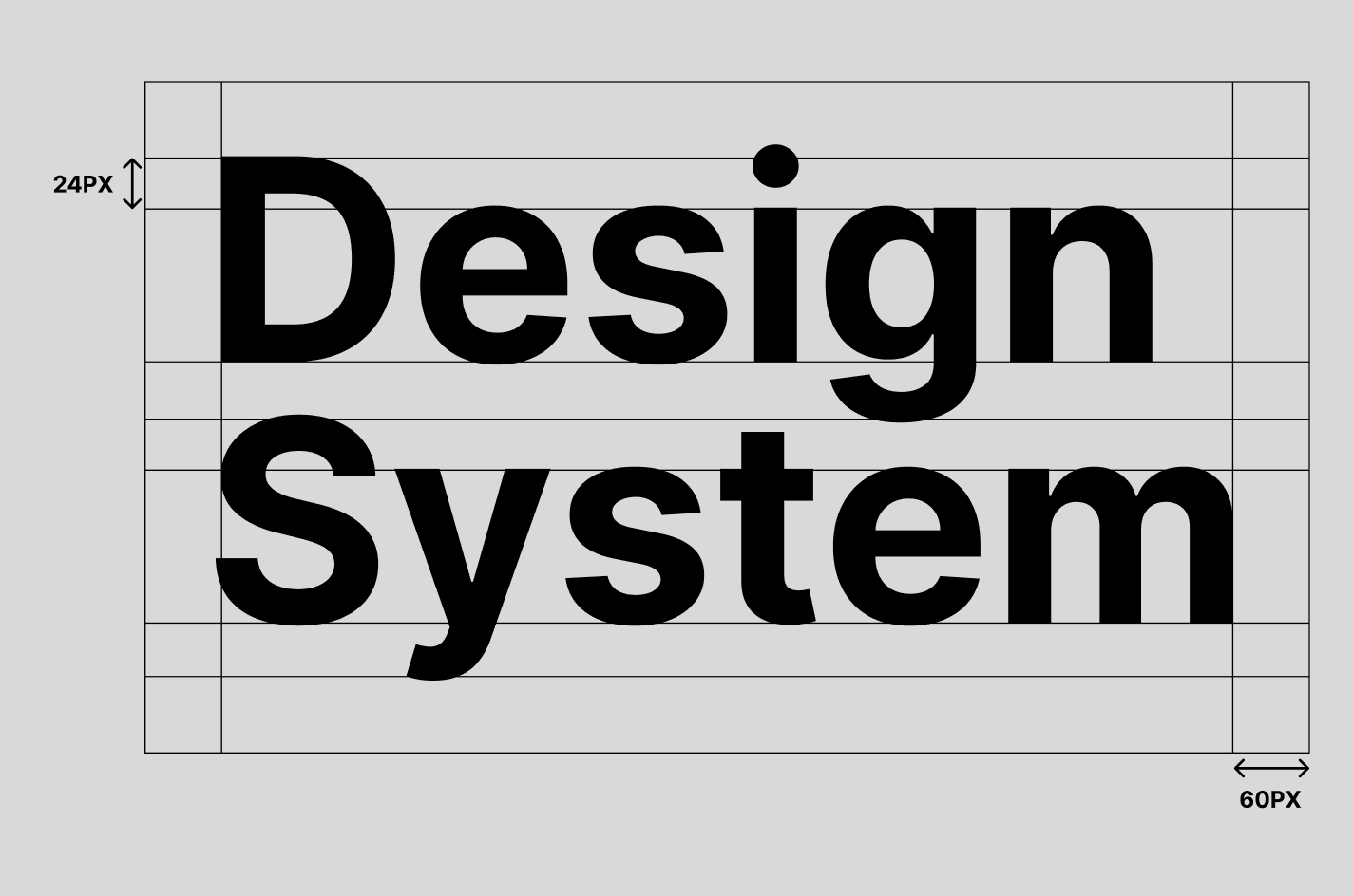
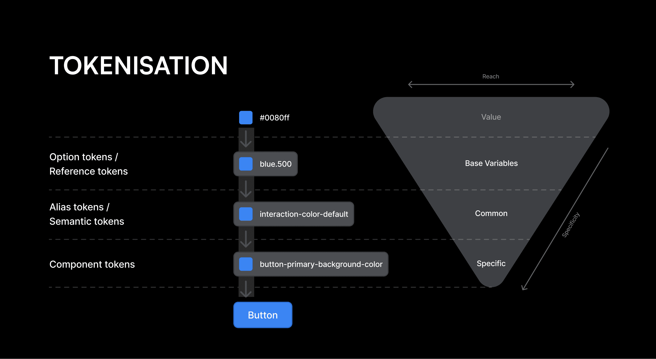
The design process started with defining foundational elements, including colors, typography, spacing, icons, border radii, sizing, and grid structures. We also laid the groundwork for UX writing, motion principles, and an illustration system. Following this, we tokenized these elements and, after extensive discussions with developers, established a comprehensive token system. We then curated and categorized components for different screen sizes and platforms, and began designing for mobile, tablet, desktop, and TV.
Test:
The next critical phase involved testing the designed components to assess their usability and ensure they were scalable and flexible. We verified that the components were ready for tokenization and that the tokens met developer standards.
Execute:
Once testing was complete, the system was rolled out to the design team and developers. We conducted various presentations and training sessions to facilitate a thorough understanding of the design system and its implementation.
Evangelize:
After the initial rollout, we continued to support the design system’s adoption through additional presentations and training sessions, ensuring that both design and development teams were well-versed in using the system effectively.










Outcome
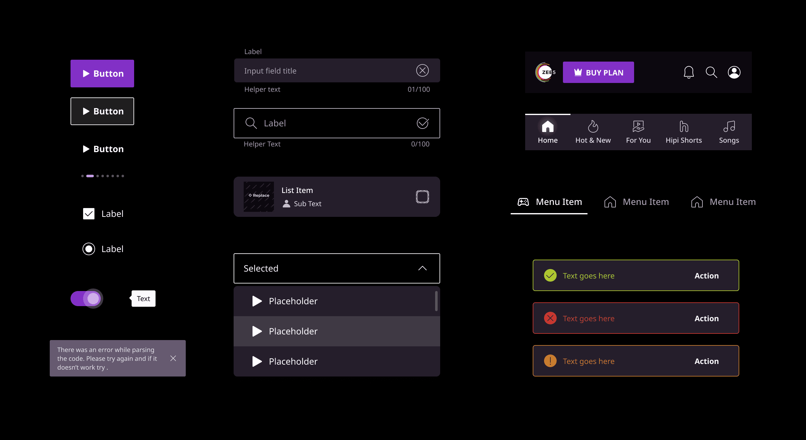
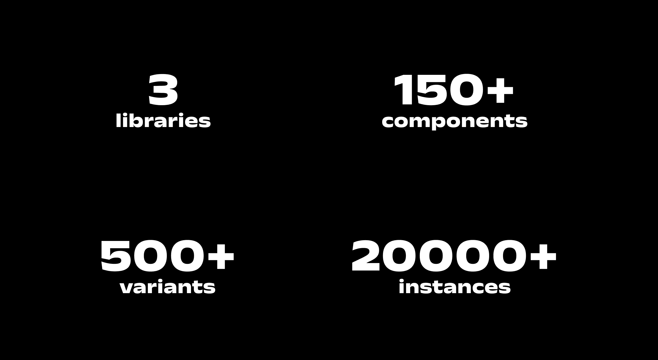
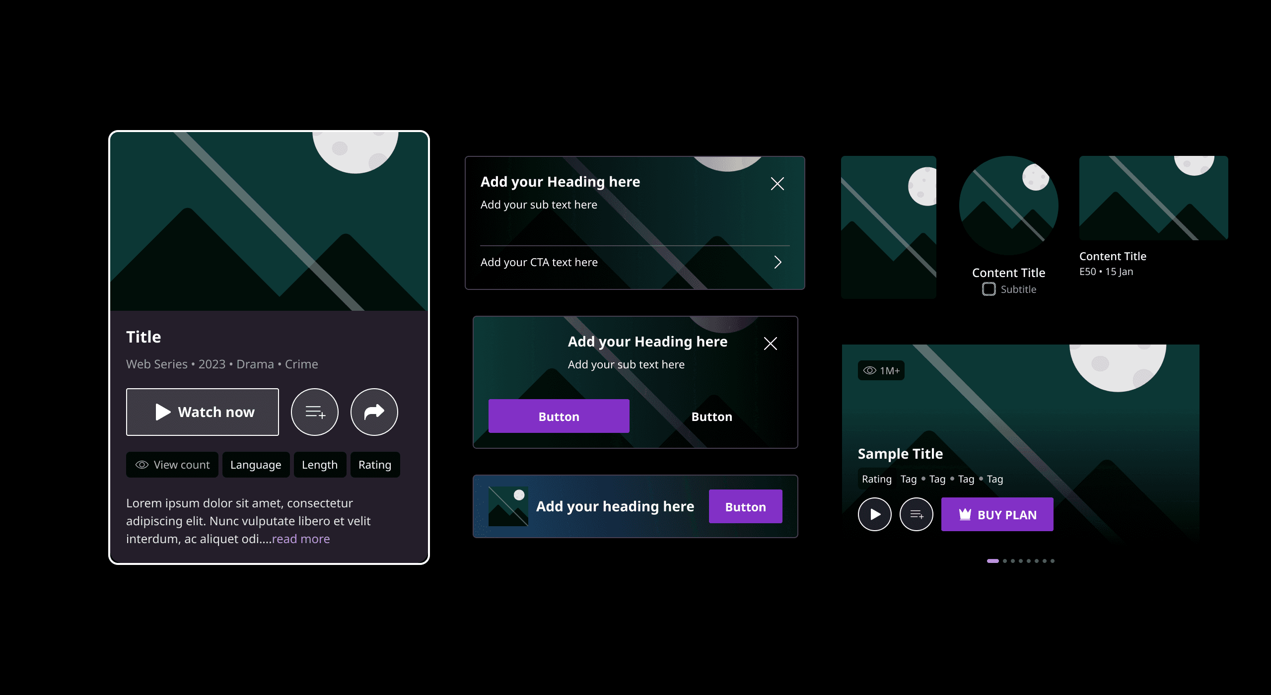
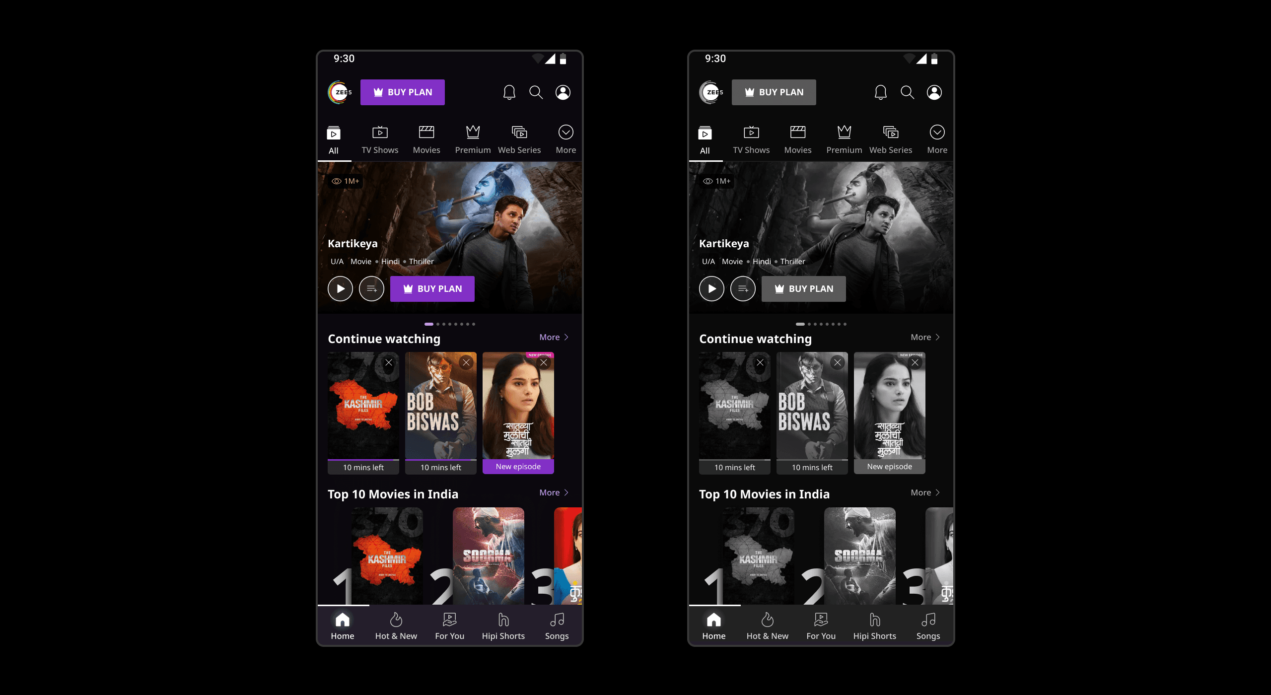
The final outcome is a well-structured design system with clearly defined foundations and a detailed component library. This system boosts productivity by shortening design and development cycles and streamlining the handoff between designers and developers. It significantly enhances coherence and consistency across the application, ensuring a unified user experience and more efficient workflows.